2022
WUXI YUNXI
Entrant
BACE DESIGN
Category
Interior Design - Service Centers
Client's Name
China Jiangsu Construction Group Co., Ltd
Country / Region
China
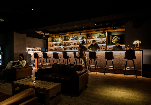
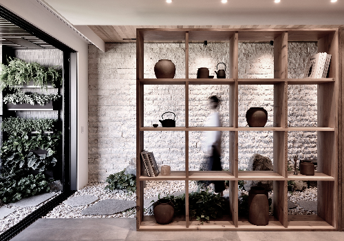
The building of the marketing center is like a huge gray white box, and the huge art installation set off by the mirror water is particularly conspicuous.
Interior design inherits the clean, concise and modern sense of architectural design. The red brick in the reception area highlights its uniqueness in the whole gray space. The interpenetration of two different blocks at the reception desk and the shape change of the ornaments echo the overall tone of the building. The large L block of the background wall is clean and not frustrated.
More Winners
Interior Design
2022
Greenland Holding Corporation Limited
Entrant
Greenland Group
Category
Interior Design - Residential

Interior Design
2022
Entrant
DONG TANG CONSTRUCTION GROUP
Category
Interior Design - Apartment
