2022
Yhousedesign
Entrant Company
yhousedesign
Category
Interior Design - Office
Client's Name
Country / Region
Taiwan
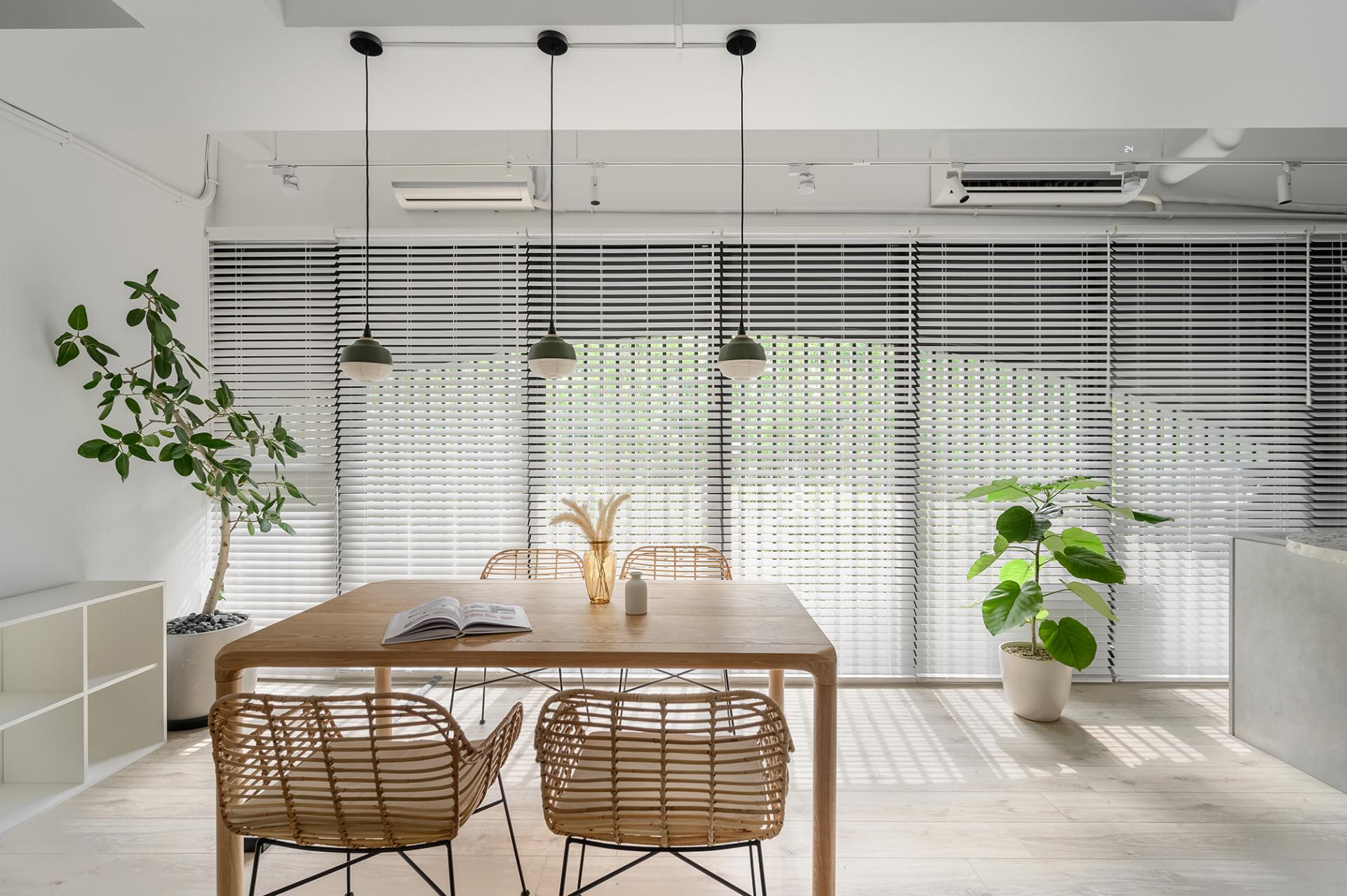
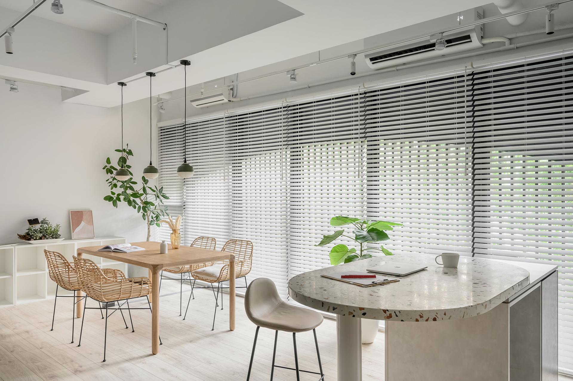
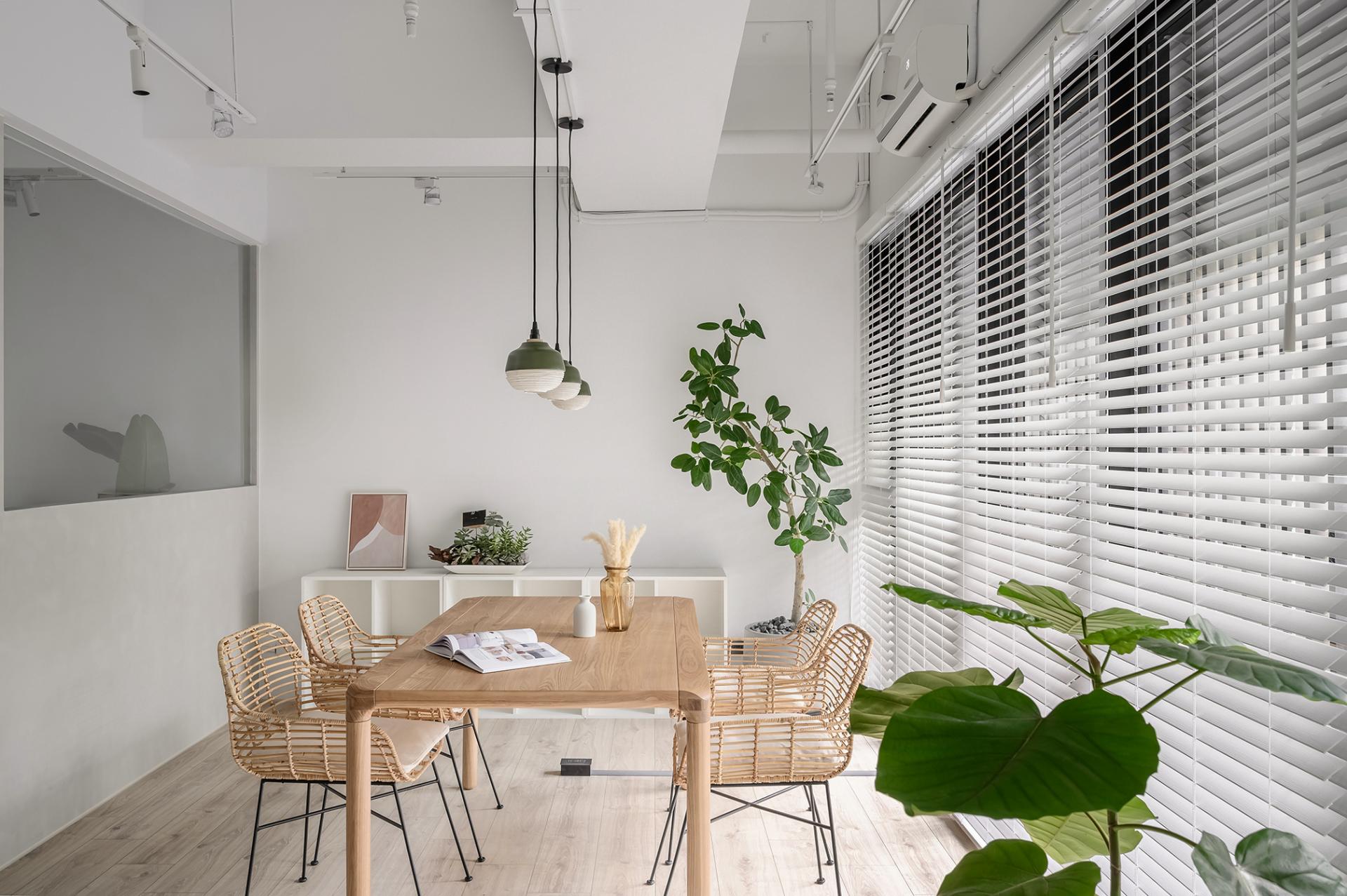
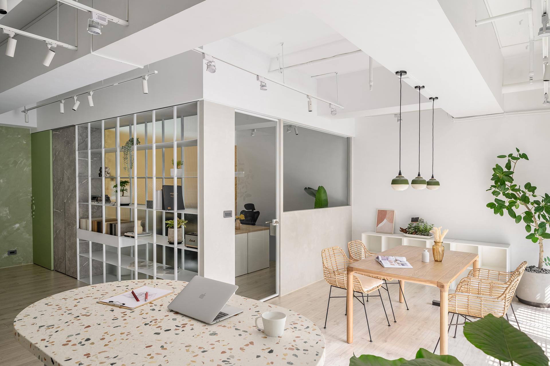
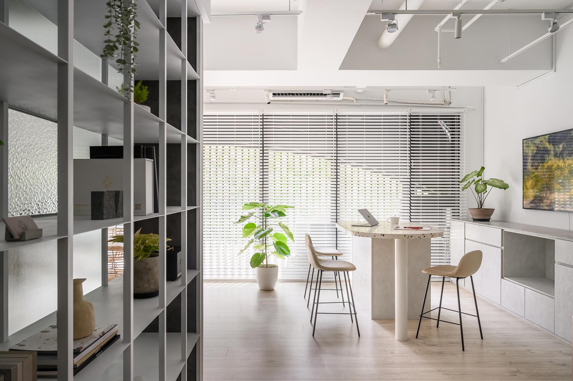
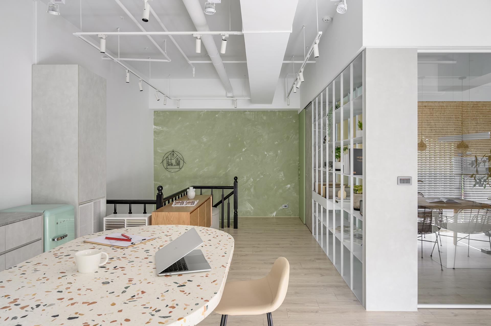
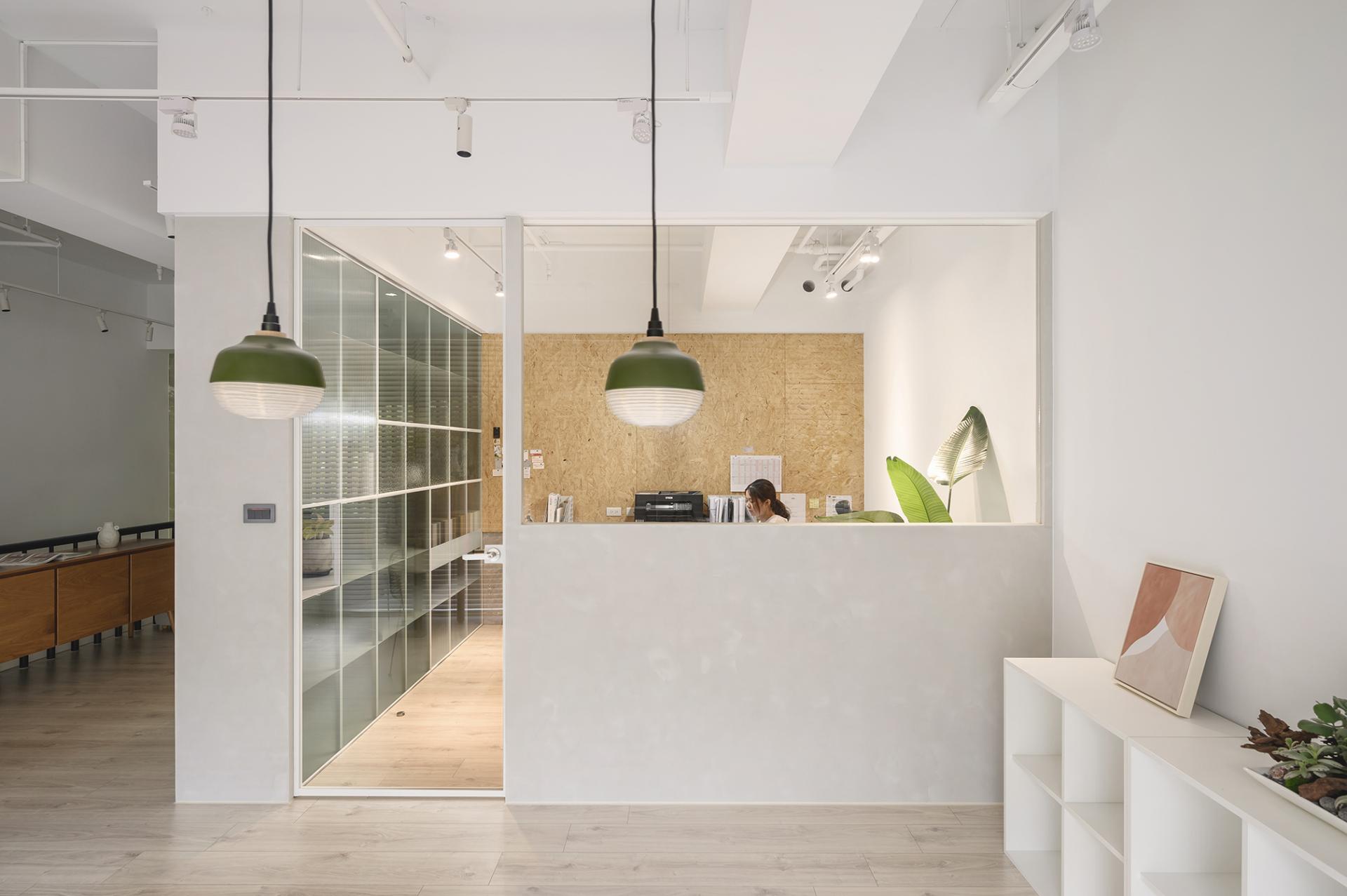
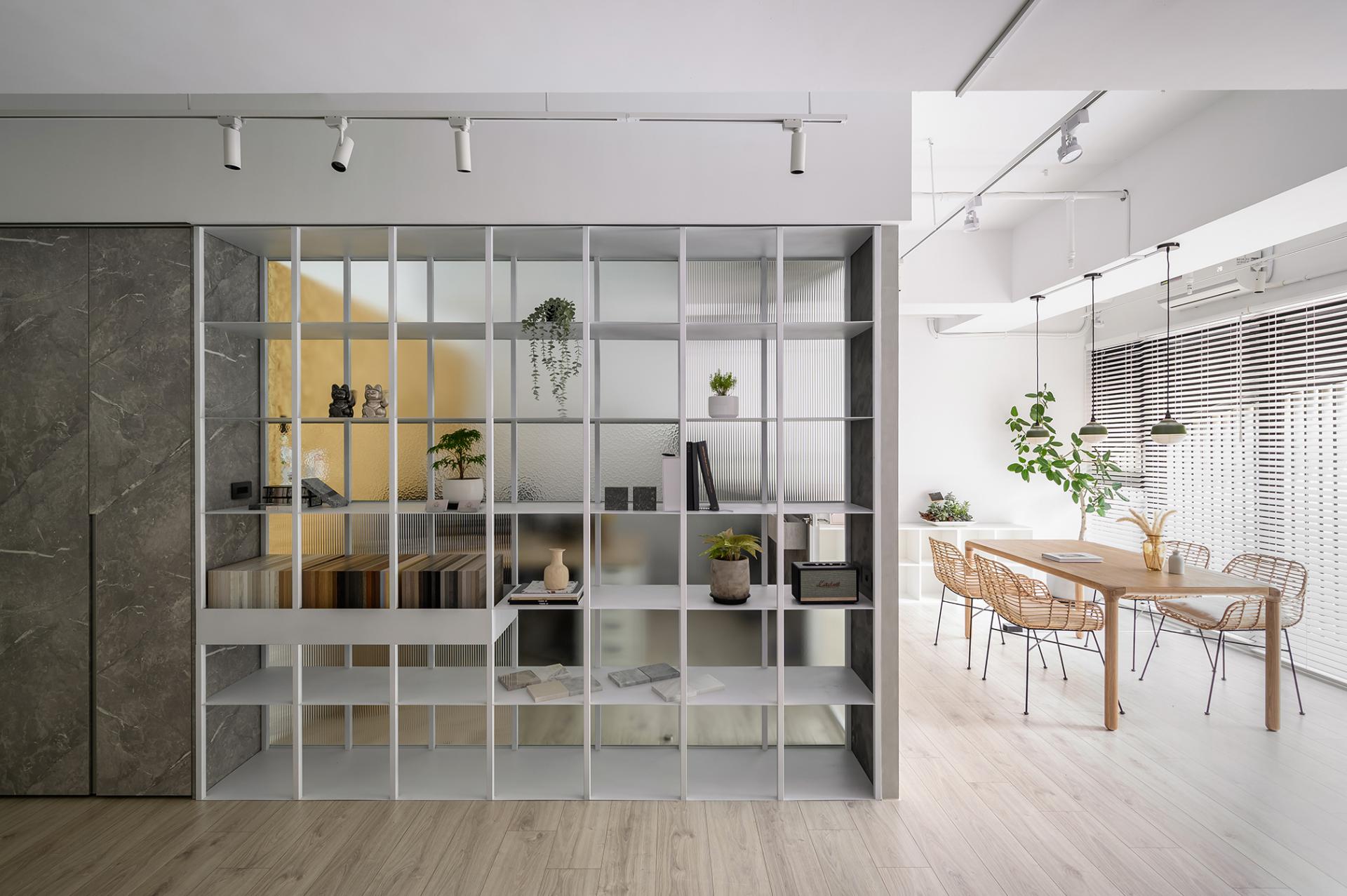
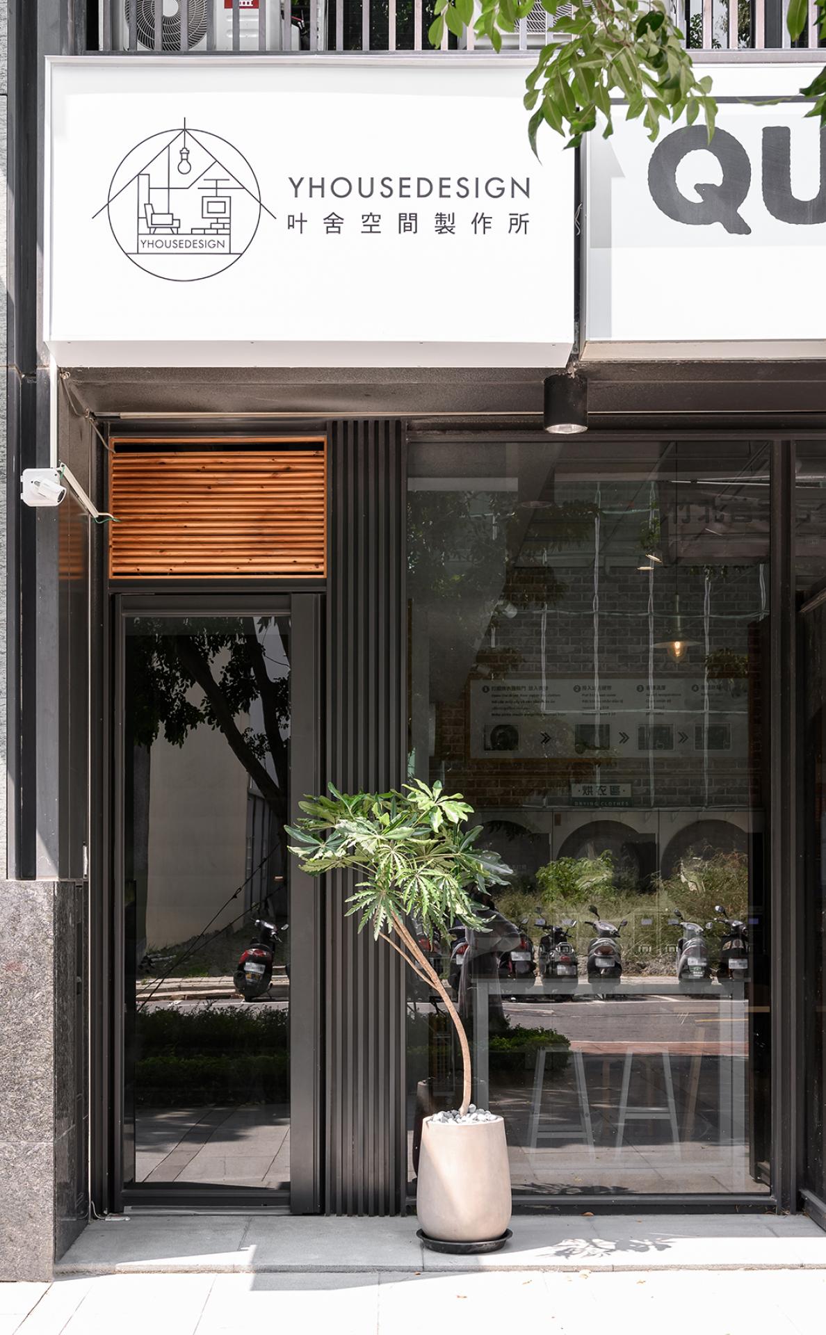
This project is the office of an interior design company, which means that the design team is also the client. The core of the space is to leave an excellent first impression on the client. The design team integrated the brand logo to reflect the company's culture. The light green color is complemented by various materials and planting to create a fresh and relaxed atmosphere. The company's logo depicts the key points. These include the spatial expression, the position of the beams, and the presentation of light and shadow. These three key points are represented in this project so that visitors can better understand what the future house will look like. Spatial expression: The site was a cram school. There were many partitions, and the space was small. After the staircase was removed, the space became narrow. Therefore, the design team effectively enlarged the horizontal space by removing the partitions. Position of the beams: In the narrow space, the design team took exposed ceilings to preserve the distance between the ceiling and the floor. The addition of the track lighting has a visual focusing effect and lengthens the vertical feel. Light and shadow: The design team used glass, ironwork, and grilles to allow light to pass through, creating variations in light and shadow.
Credits
Entrant Company
Pure Interior Design Limited Company
Category
Interior Design - Residential

Entrant Company
Yu [ i ] Design Studio
Category
Interior Design - Residential

Entrant Company
Interscape Design Associates
Category
Interior Design - Residential
