
2023
City Ridge
Entrant
Brand Bureau
Category
Property Strategic Program - Brand Strategy Campaign
Client's Name
Roadside
Country / Region
United States
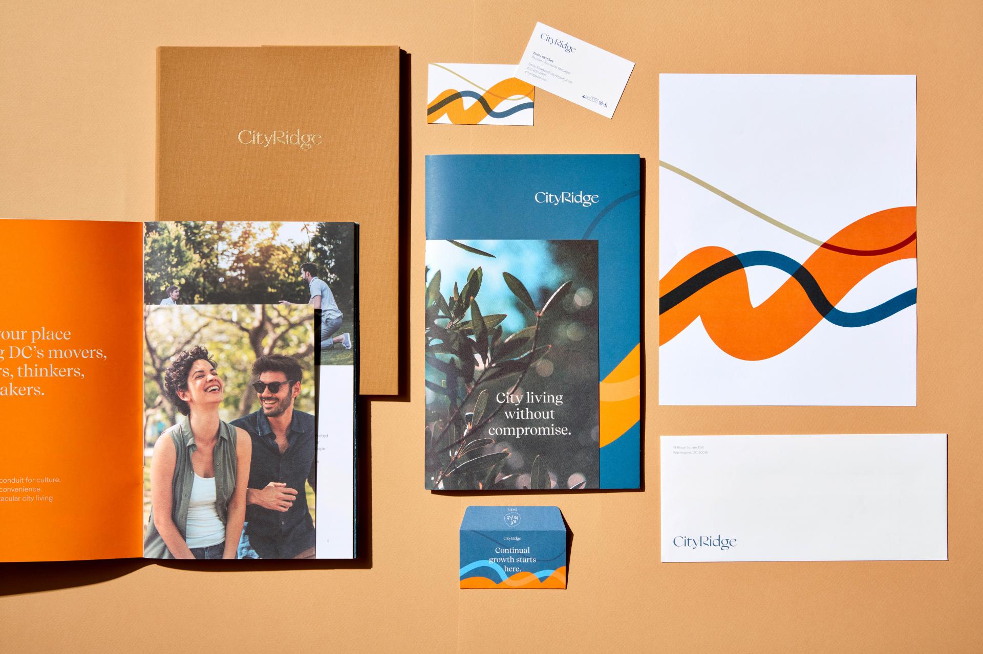
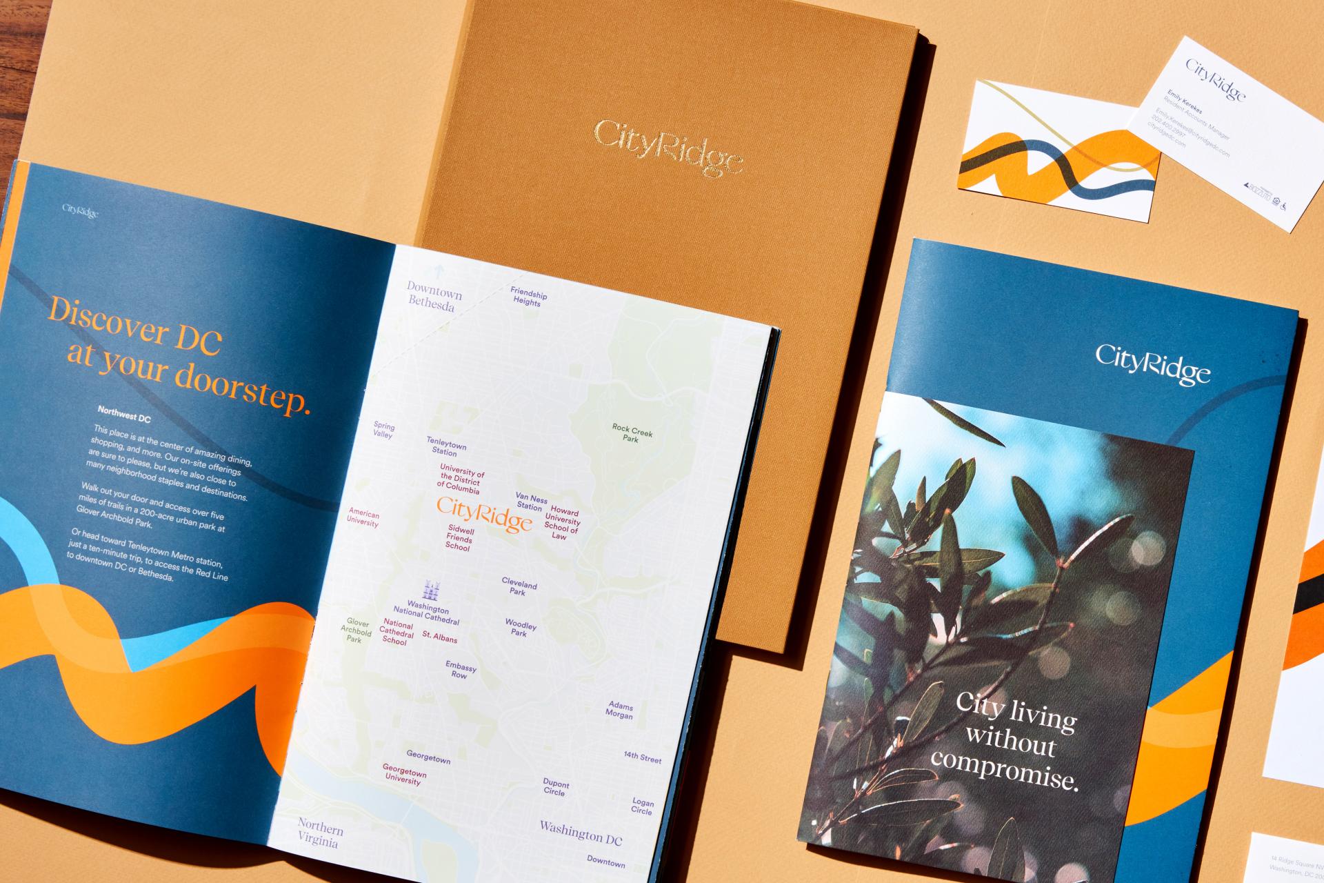
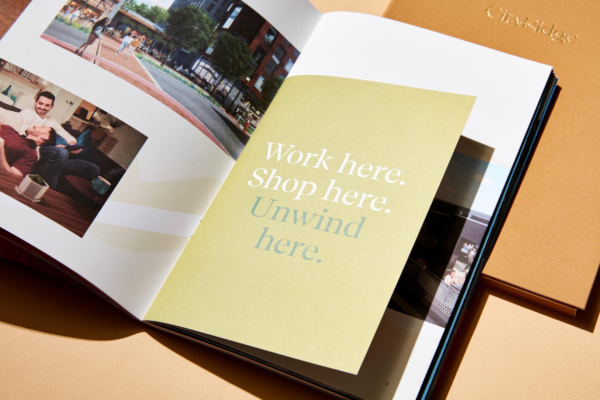
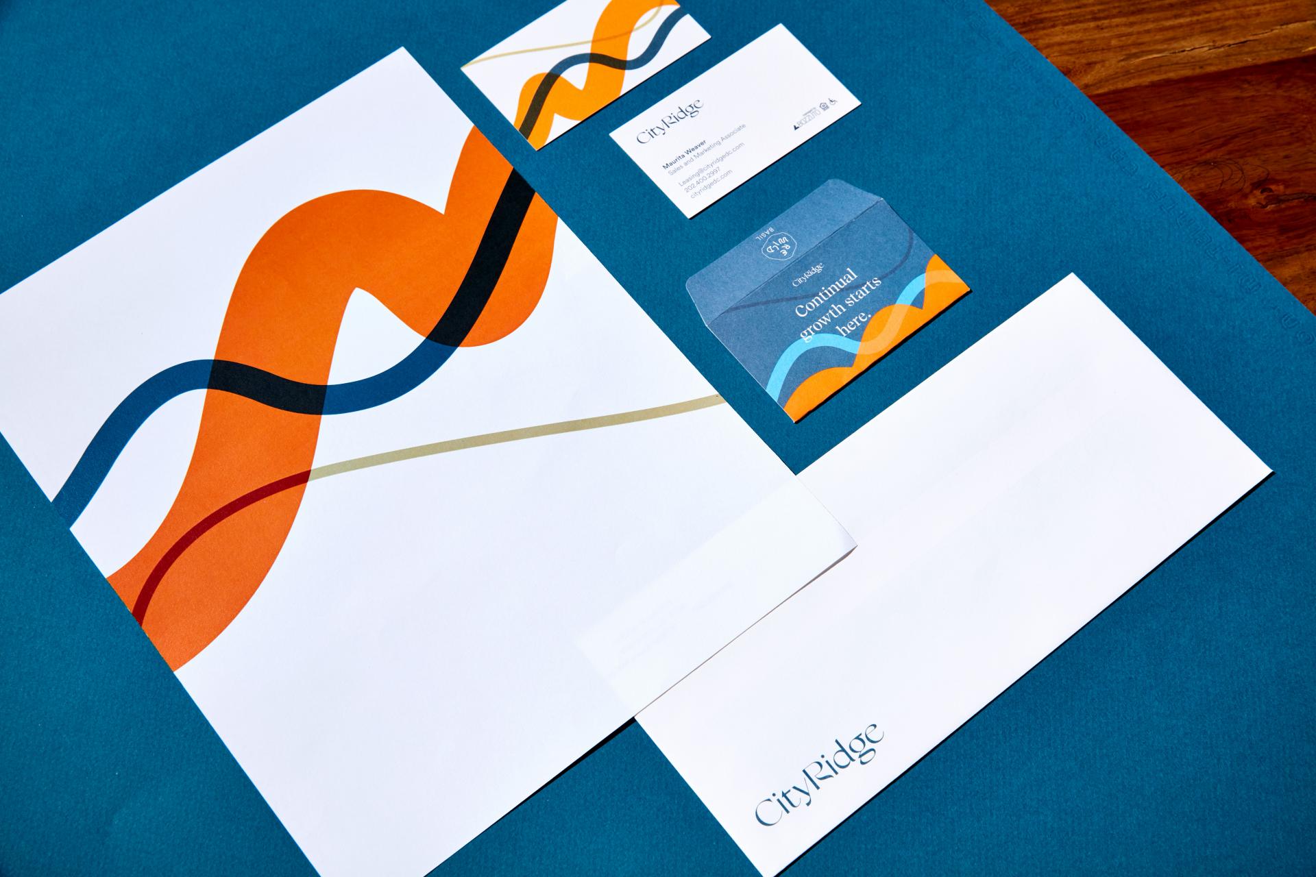
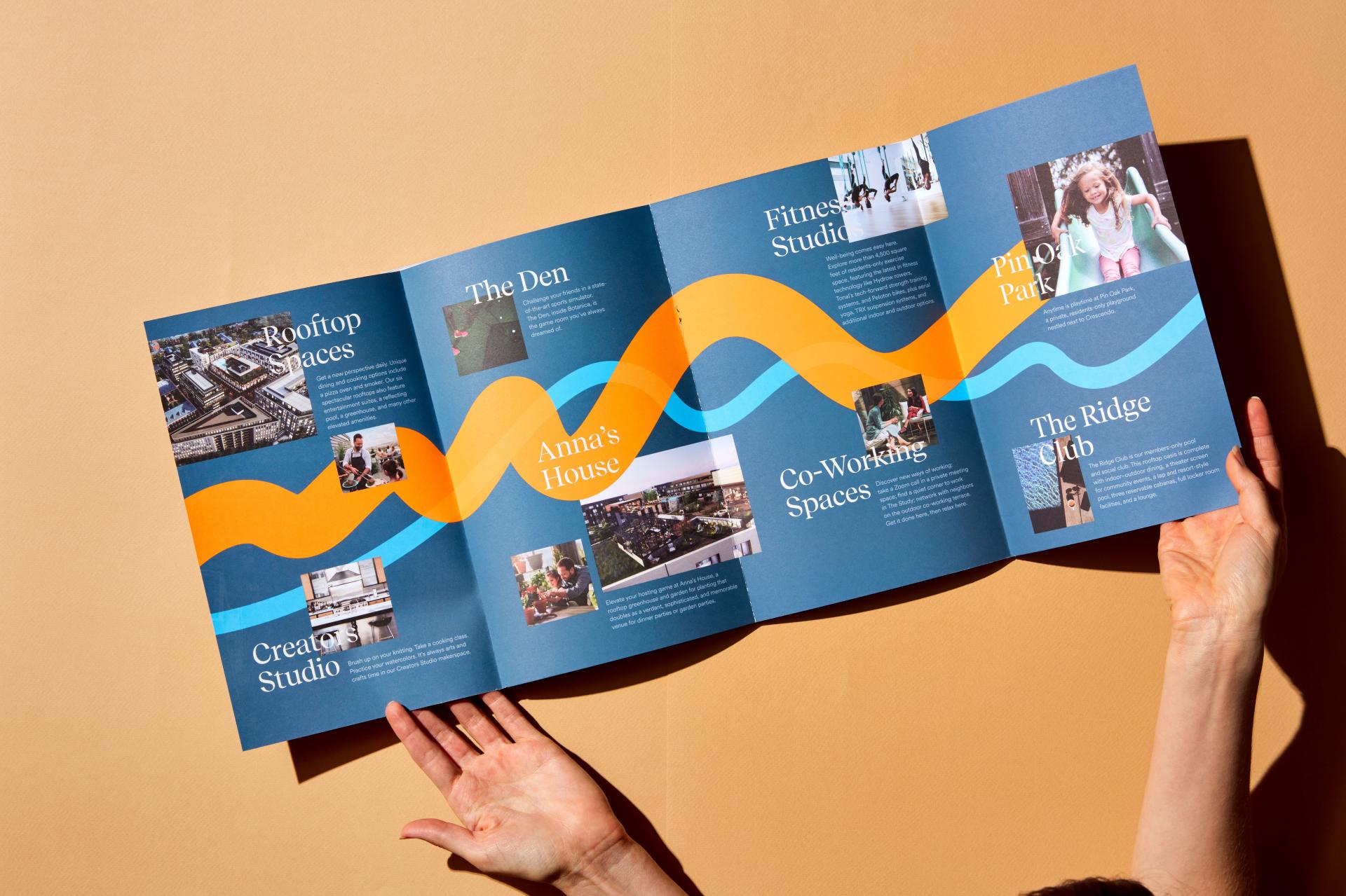
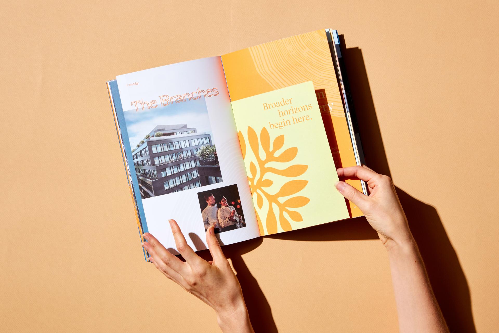
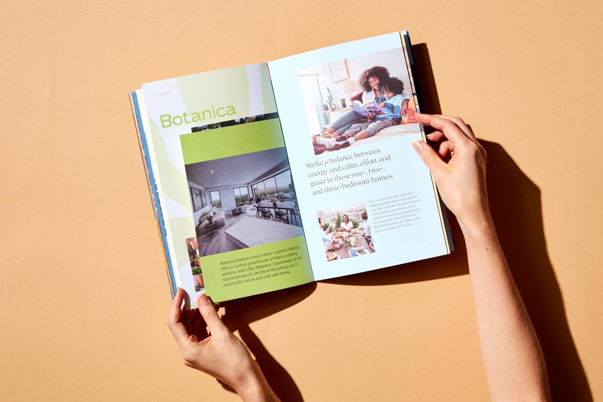
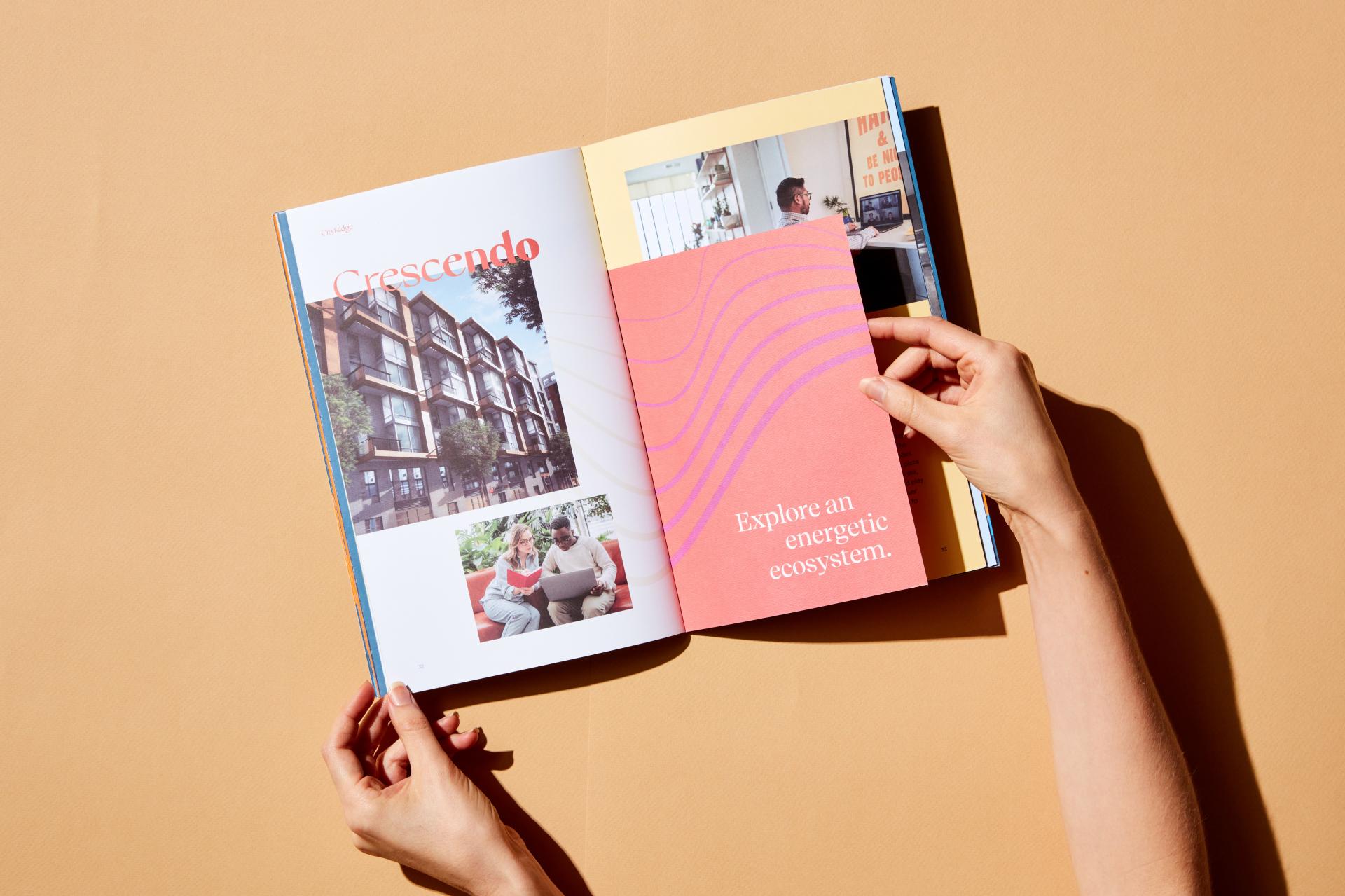
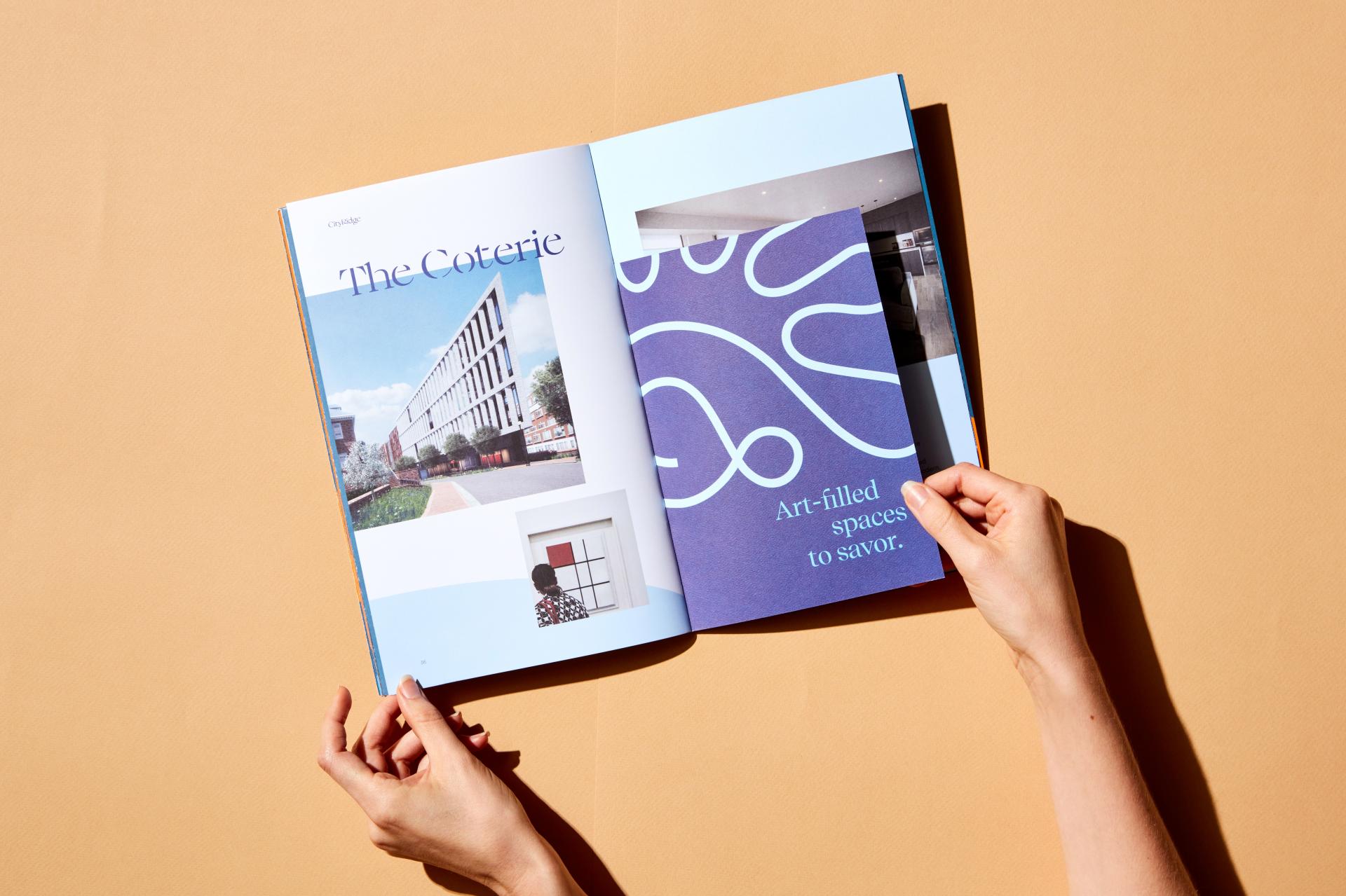
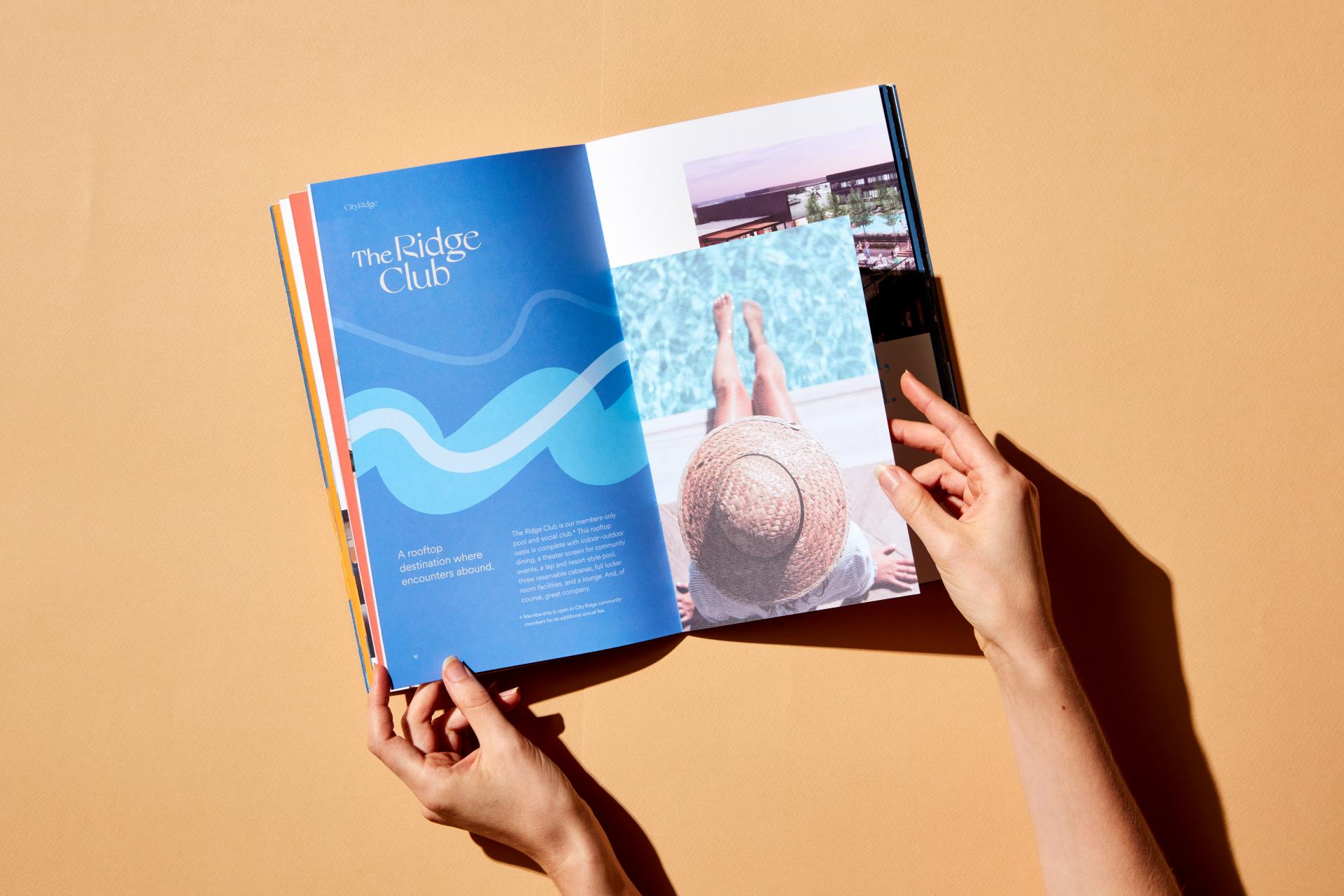
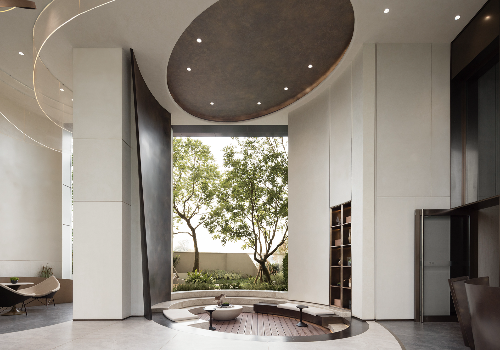
City Ridge is a 1.8 million SF mixed-use development in Washington DC, providing residential and commercial space alongside hospitality and public space amenities. We were tasked to position City Ridge as a truly special and dynamic place that offers a new way to live in DC, and to create a brand ecosystem that would help the development’s audiences intuitively navigate the various offerings. We knew that the parent brand would be the leading visual communicator of the development, having a broad reach across a variety of mediums, from printed collateral to digital ads. Our core positioning established City Ridge as “An Environment for Becoming”—a vibrant, forward-thinking community that fosters a lifestyle centered on continual evolution. We took key notions from this positioning and expressed them through the visual identity, developing graphic moves that evoke discovery, geniality, connection, and journey. We also found inspiration in the site’s topography, as its location on the highest ridge in DC is where the name “City Ridge” originated. The logo features a customized typeface that is contemporary and elegant, using touches of fluidity and flourishes of brushed hand-lettering. The identity combines a playful serif and a functional sans serif with a vibrant and extensive color palette. Graphic patterns amplify the brand’s spirit, with undulating lines in a variety of thicknesses that suggest dynamic motion and take viewers on a journey, as well as nod to a ridgeline. All these pieces combine into a graphic toolkit that is both prescriptive and adaptable, allowing each piece of print and digital collateral to have its own expression that is uniquely City Ridge. When positioning the residential, office, and members club sub-brands, an endorsed brand architecture afforded sufficient differentiation while reinforcing the core ideas of City Ridge. Each of the six sub-brands features a color from the parent brand’s palette as its hero color; has its own take on graphic linework; uses the same body font as the parent brand but a unique serif headline font; and has its own custom logotype that visualizes its unique offering. The outcome is a dynamic and cohesive brand family.
Entrant
Kris Lin International Design
Category
Interior Design - Exhibits, Pavilions & Exhibitions
Entrant
NINE STARS INTEGRAL DESIGN CO., LTD.
Category
Interior Design - Office
Entrant
Nine Dimension Design
Category
Interior Design - Sports / Entertainment
Entrant
INSIDE (BEIJING) DECORATION DESIGN CO.,LTD
Category
Interior Design - Commercial