2022
Ascending Culture & Media Group
Entrant
ZHHM Design
Category
Interior Design - Office
Client's Name
Ascending Culture & Media Group
Country / Region
China
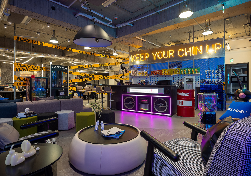
Developed on the concept of "creation + experience", this project intends to integrate abstract elements into the space and to connect external visual experiences with the brand's core values as an approach to express rational logic and perceptual changes. Colours and other elements are selected from the branding identity to form visual contrasts causing the viewer's sensorial and emotional changes.
The morphological relationship between the orderly organizational block of space and color describes the brand identity derived from the spatial representation, simplifies the internal structure of space and the complexity of equipment, and presents it in the space in a strong way.
The entire space uses a pure grey tone as the main colour, with a touch of blue added from the brand colour palette. The design breaks the boundary and establishes open interactions between spaces. For example, the stairway serves as a medium to all areas to satisfy the needs of employees in different work scenes. Meanwhile, the project employs the flow of natural lights to bring changes to the space.
CLIPSE is a concept inspired by the astronomical phenomena of lunar eclipses when the sun, the earth and the moon are precisely aligned. This device uses unevenly designed central light with concentric disc lighting to produce a mutual attraction effect. At the same time, the fading light is used to form a strong contrast with the dark color of the base, so as to symbolize the light and hope in the declining world.
Credits
Entrant
PAI SHI INTERIOR DESIGN
Category
Interior Design - Office

Entrant
CHI-R Interior Design
Category
Interior Design - Residential

Entrant
GREENTOWN CHINA HOLDINGS LIMITED
Category
Property Development - Property Development / Other____
